
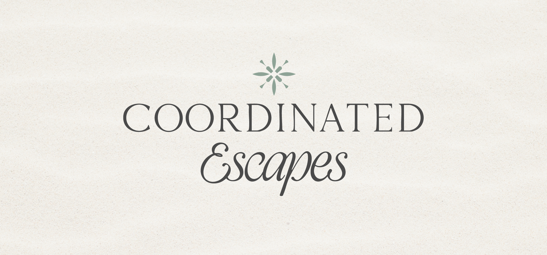
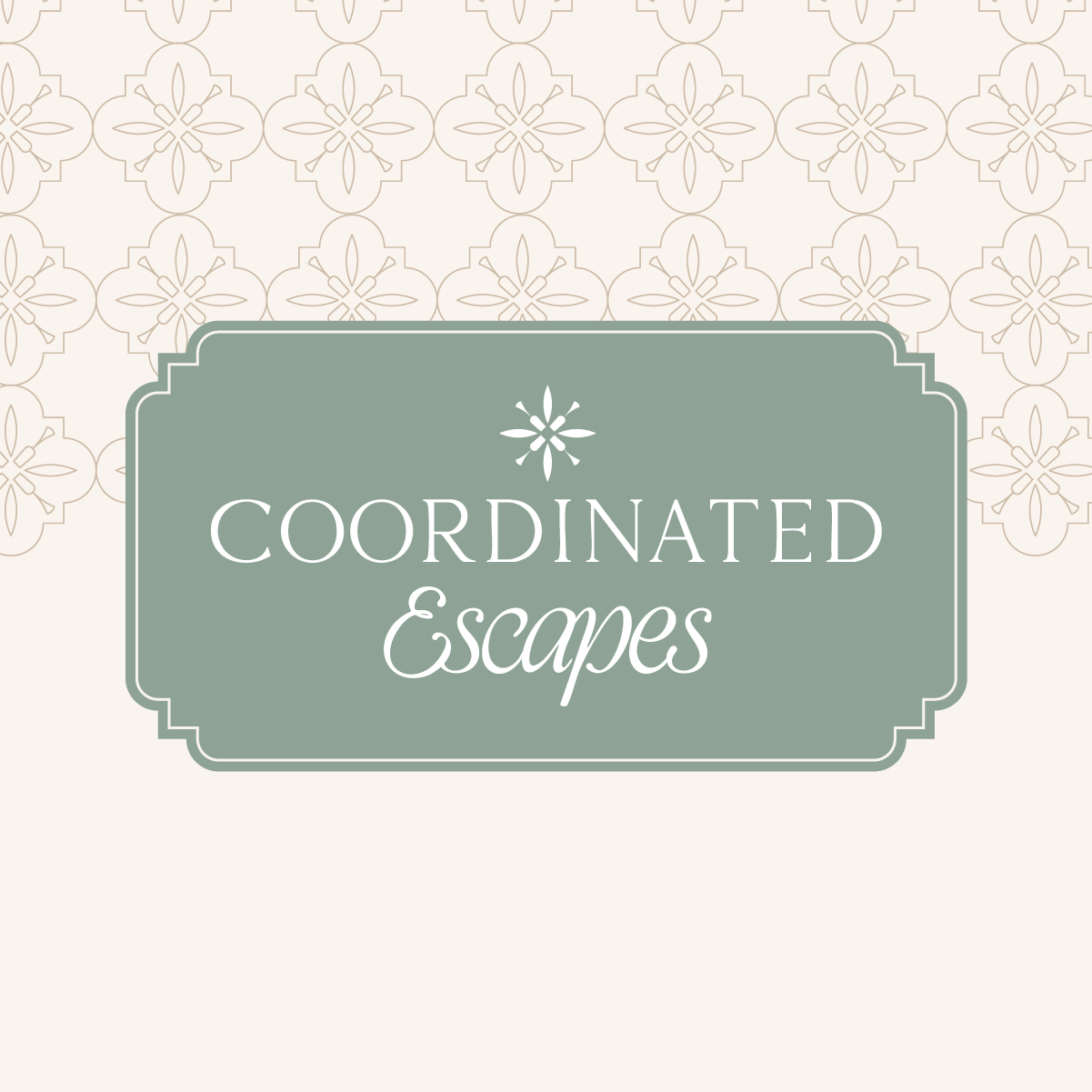
Branding for Coordinated Escapes
I’ve worked with Heather for 8 years on her accounting business, Number Nerd Bookkeeping. Late last year she told me she was launching a second business as a luxury travel advisor and I was so excited to get started on the branding work.
Here’s a little insight in to the design and the ideas behind it:
“At Coordinated Escapes, we design elevated, custom journeys that transform milestone moments into extraordinary shared memories. Whether you're toasting 40 with your closest friends in Positano or slipping away for a second honeymoon in Saint Lucia, our escapes are intentionally crafted to feel indulgent, intimate, and utterly unforgettable.”
Key Words: Luxury, Bespoke, Curated, Escape, Experience, Indulgence, Memorable, Elevated, Sophisticated, Romantic
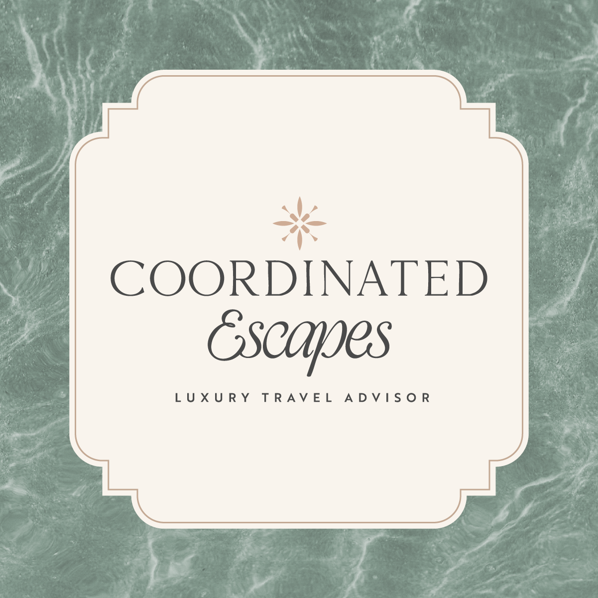
The colour palette was inspired by elements of the trips that Heather would be planning:
Soft neutrals inspired by white sandy beaches and crisp champagne
Warm terracotta inspired by sunsets and tiled balcony floors
Muted turquoise inspired by calming seas and luxury pools
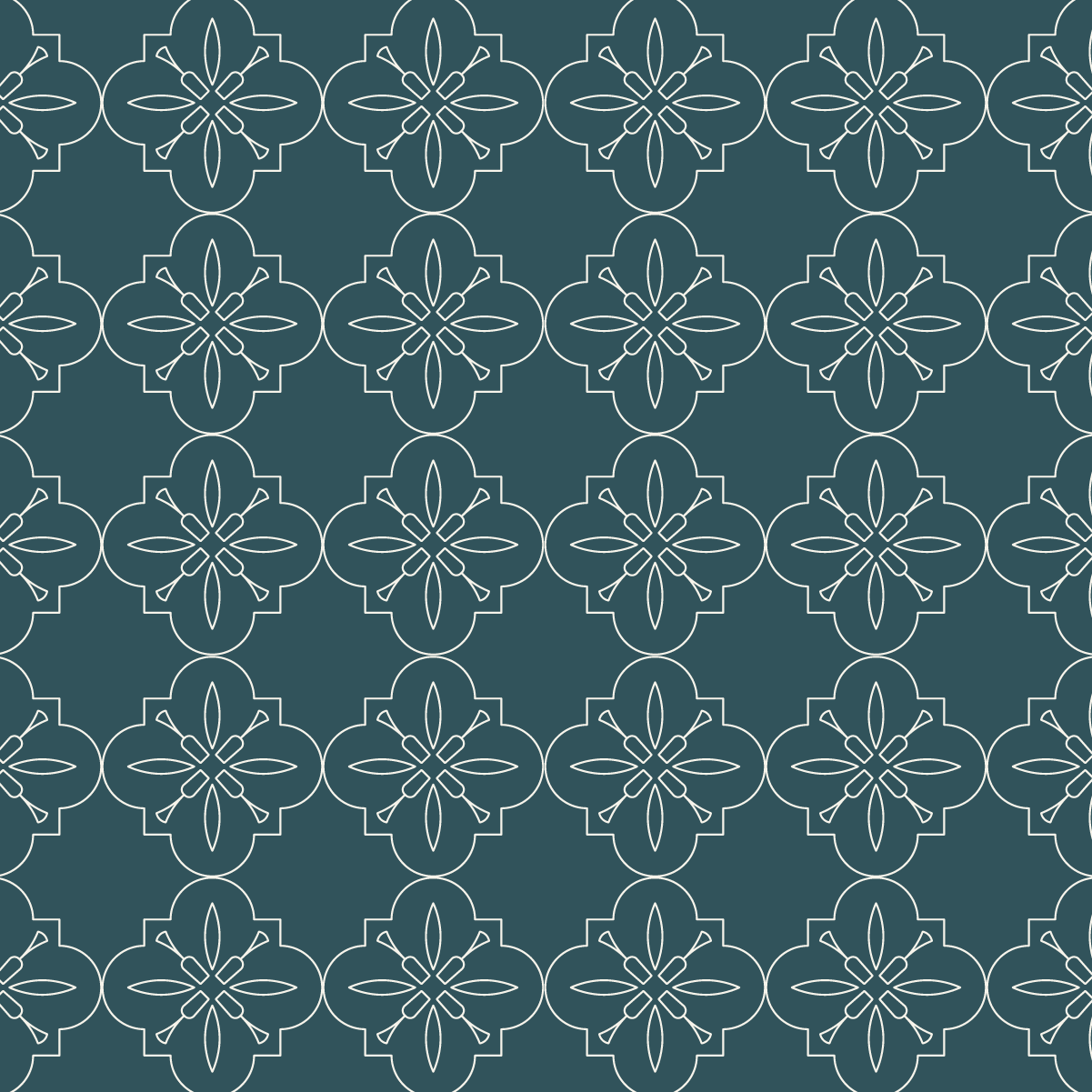
Dark Teal inspired by deep oceans and new luggage
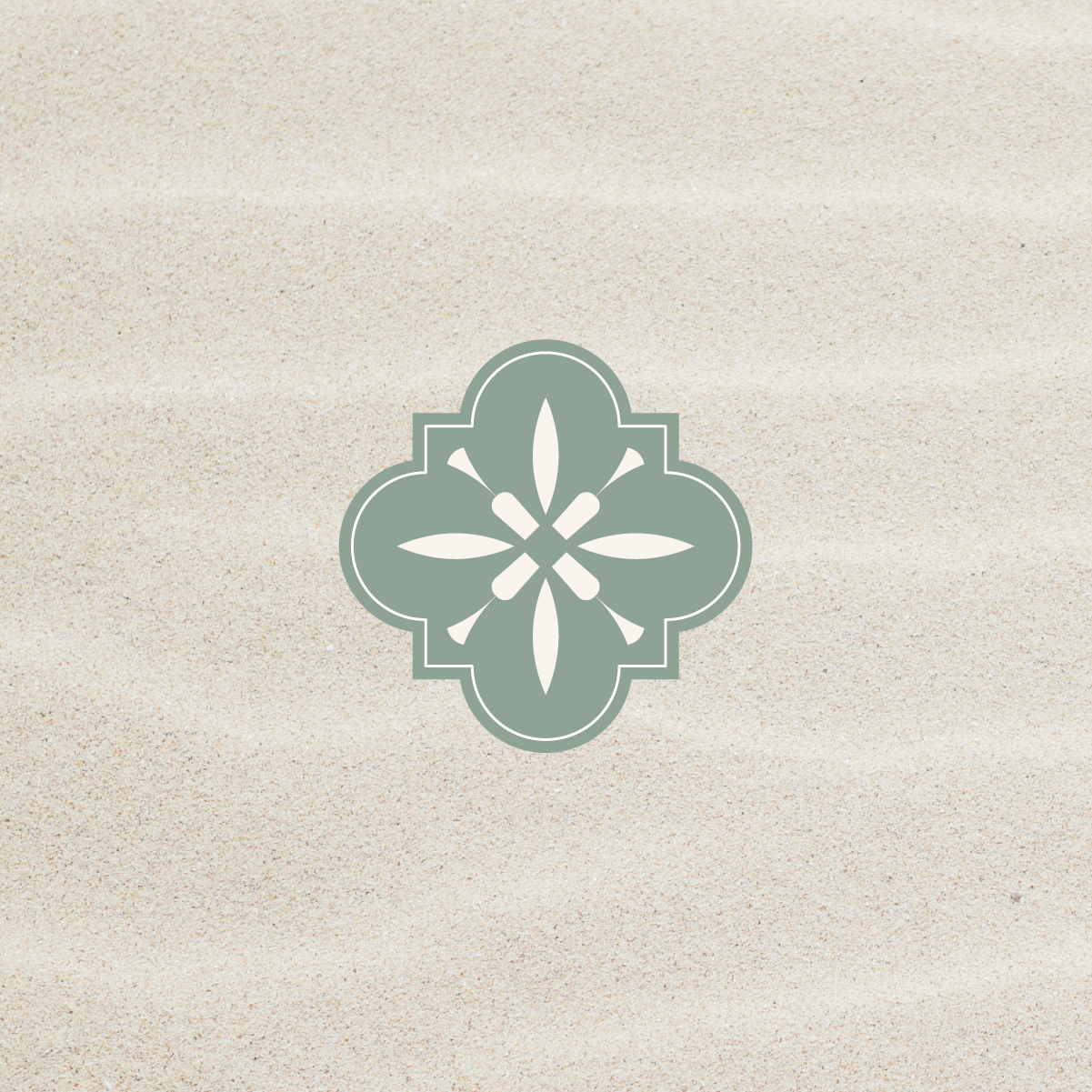
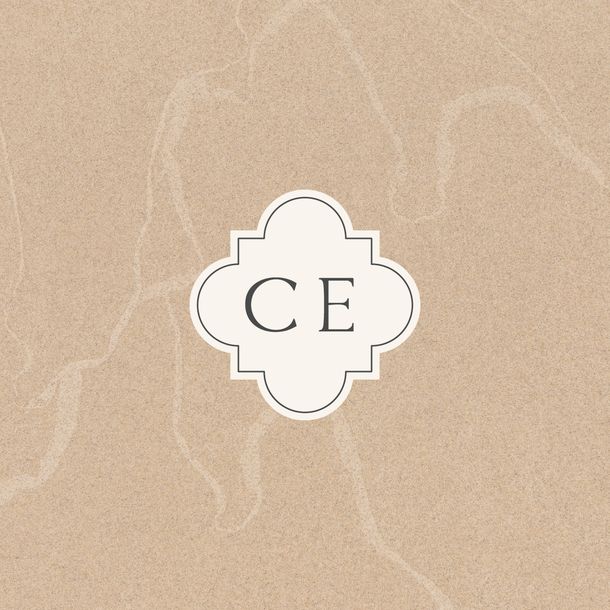
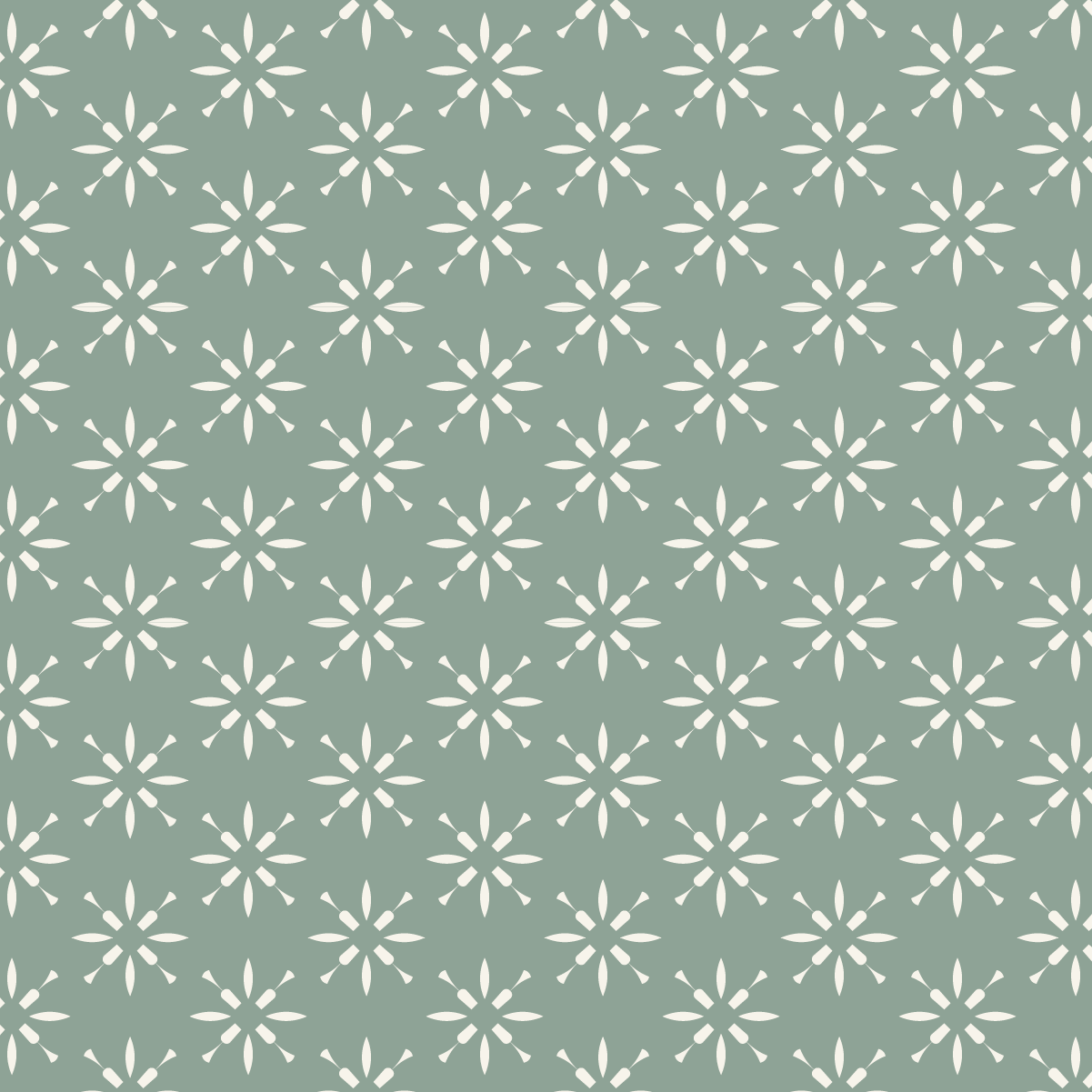
The icon/motif is inspired by patterned tiles often found in hotel receptions and on private balconies and often associated with travel. The design includes the shape of a champagne glass, symbolising the luxury and celebration elements of the brand. There are 4 champagne glasses meeting in the middle, a nod to sharing these experiences with loved ones. The shape of the tile icon is mirrored in the shape of the text boxes/containers for social graphics and documents, and elements of the icon have been repeated to create background patterns.
Ready to work on the branding for your own business?