

Branding for The Living Room

I’ve been so looking forward to sharing this project and the story behind it, and it’s finally time to do so!
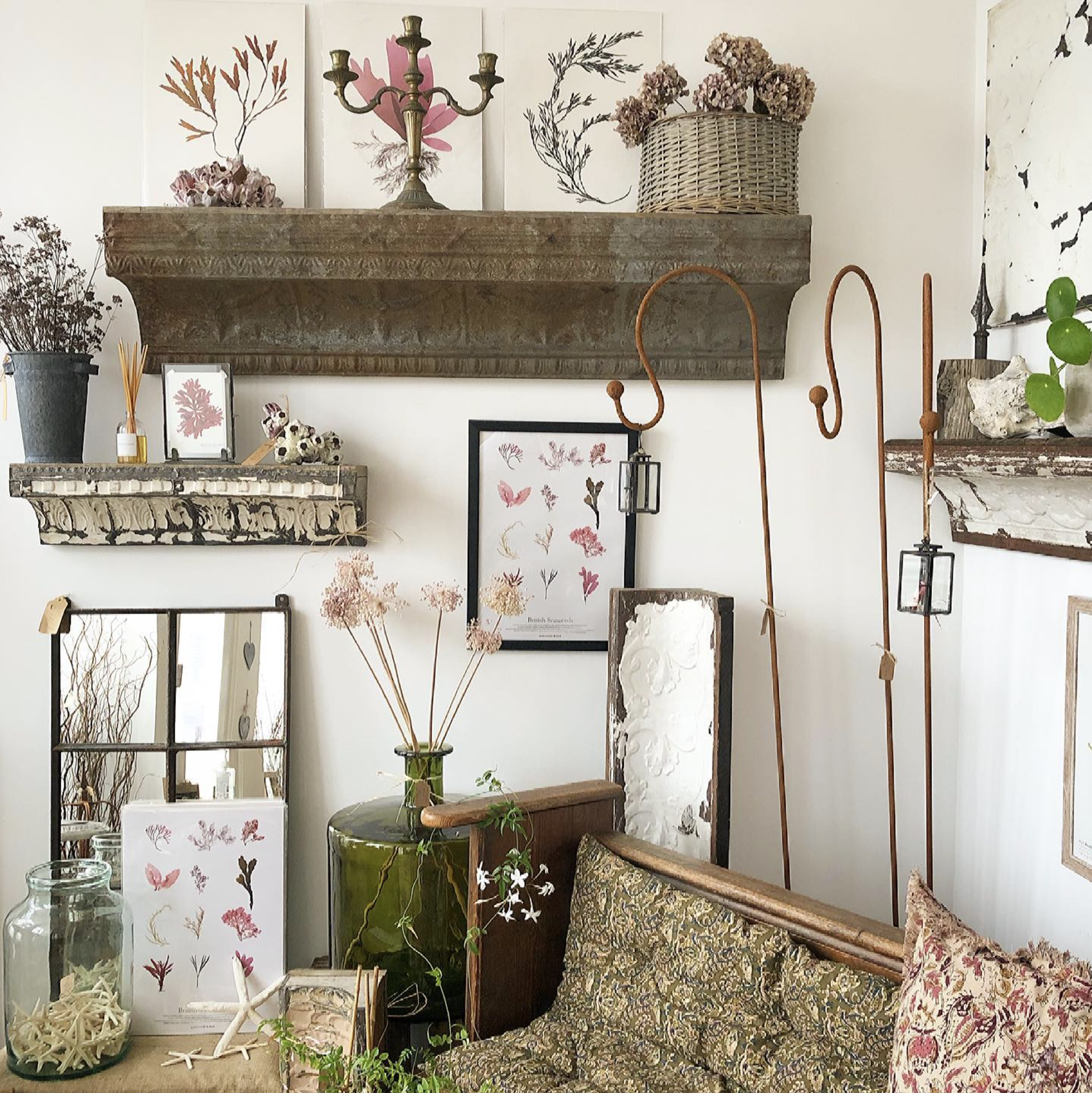
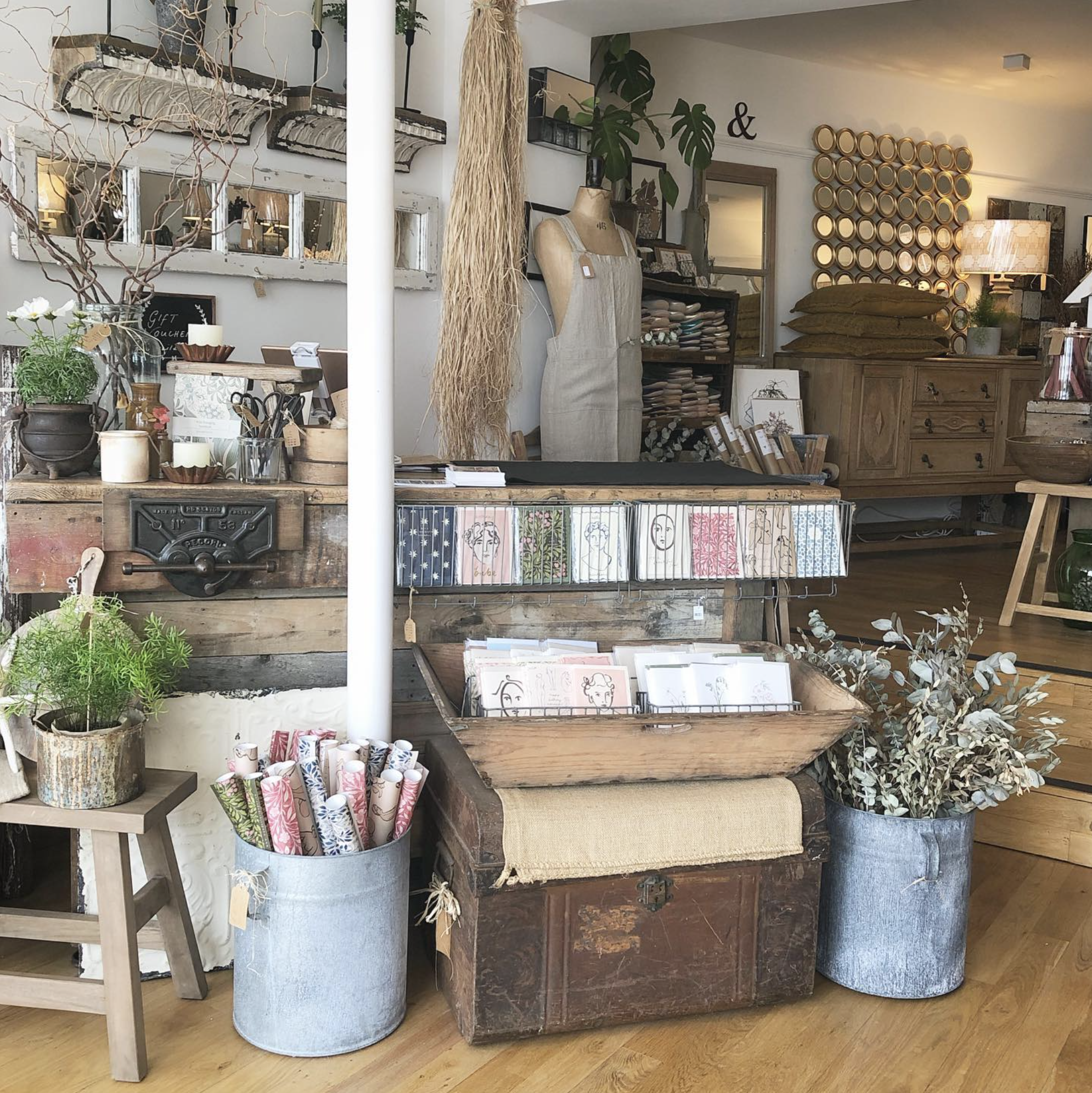
Last summer we moved to the coast in West Sussex, and in the first couple of weeks I went for a wander around the nearby town Shoreham-by-Sea. While I was there I found what quickly became my new favourite shop - The Living Room.
I also met the lovely owner, Hayley, and we got chatting and followed each other on Instagram. A little while later I revisited the shop and we got chatting again, this time about branding (something Hayley has been wanting to work on for a while) and we agreed to work together.
Its been so lovely having a client so nearby, and being able to chat through ideas in person made such a difference to the project. Standing in the shop and looking around at all of Hayley’s beautiful stock, I knew right away the feel and style that I wanted to go for.
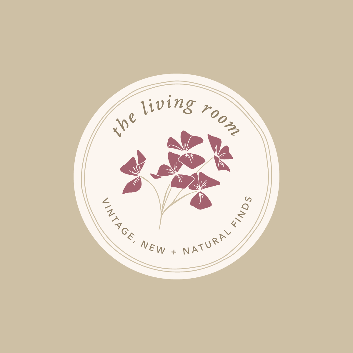
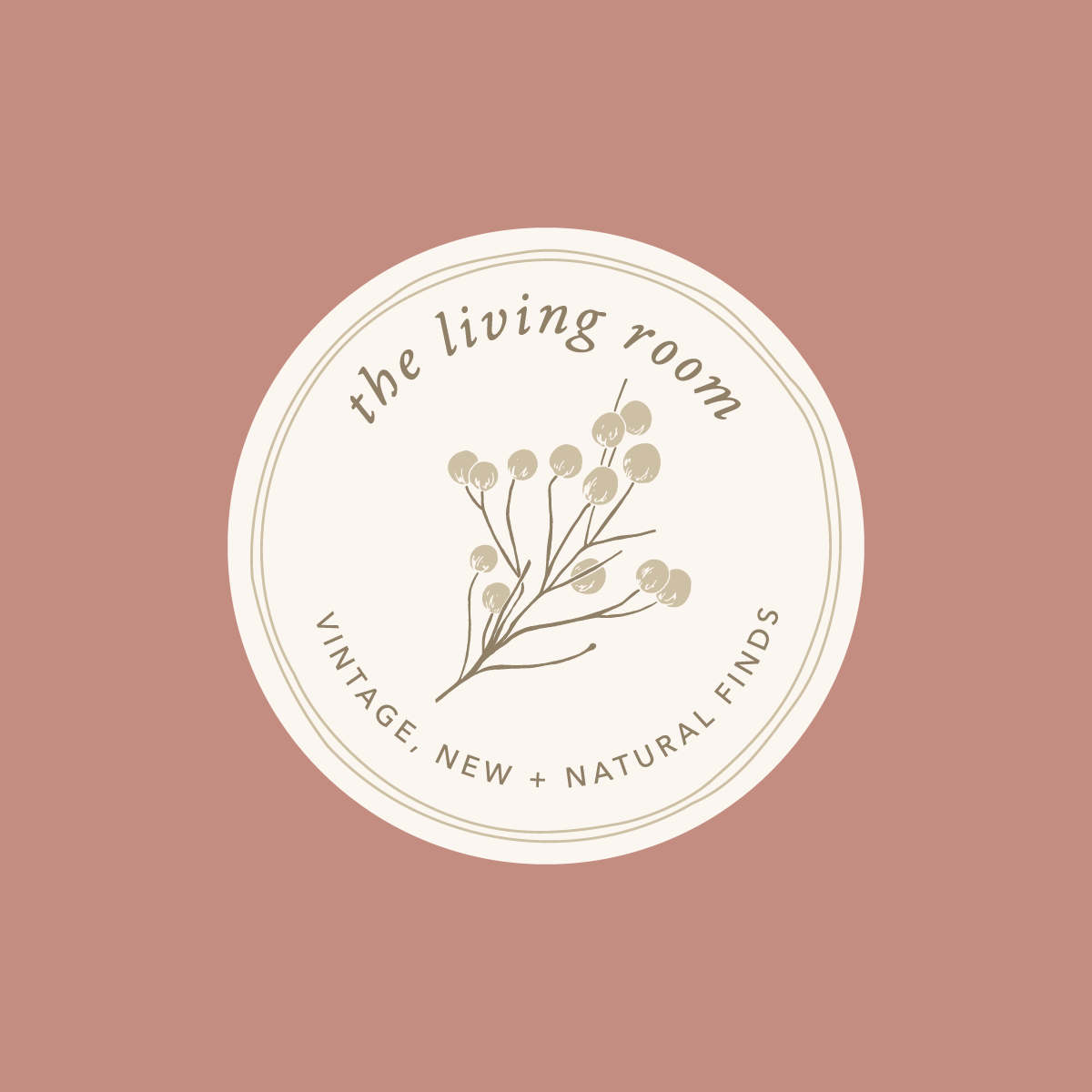
There was already a sign out the front of the shop that Hayley doesn’t want to change at this point, so I wanted to make sure the new branding fitted in with that, whilst also leaning towards the vintage, organic feel of the shop itself. To achieve this, I took the letterforms of the existing signage, and created a custom font - adding serifs and imperfections to get that vintage feel.
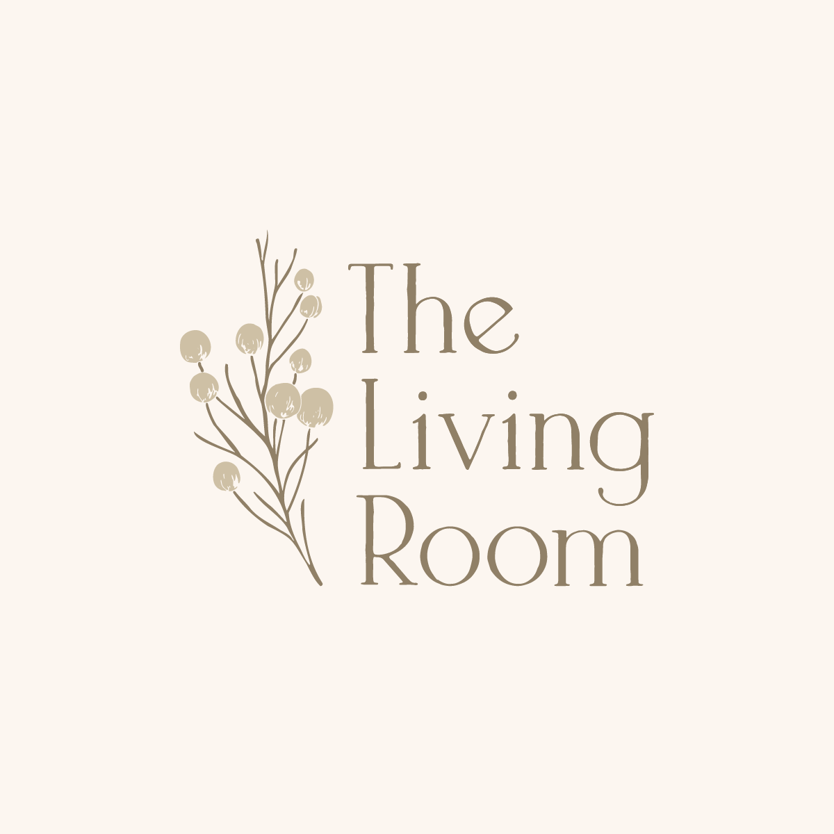
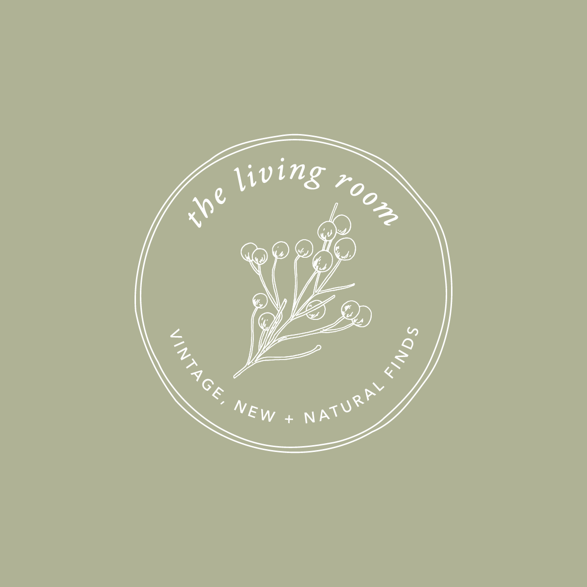
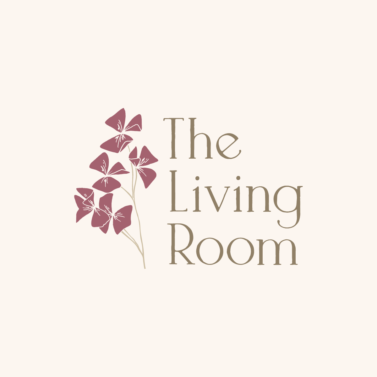
The botanical illustrations within the branding, dried Sea Kale and Oxalis, are also inspired by the decor of the shop, and hold an importance to Hayley too (she used to gather the dried Sea Kale from the local beach to use on her stalls at vintage fairs)
We knew from the start that the colour palette would consist of natural colours - mainly greens, neutrals and pinks - and definitely no blue! I pulled an initial palette from images of the shop (particularly a range of taper candles in a gorgeous range of greens and pinks) and after a few edits we settled on the final palette. When I went in to visit Hayley last week and see the new stationery items in person, she was wearing a lovely cardigan in the exact pink/purple shade from the brand - so we now it was the perfect fit for her and her shop!
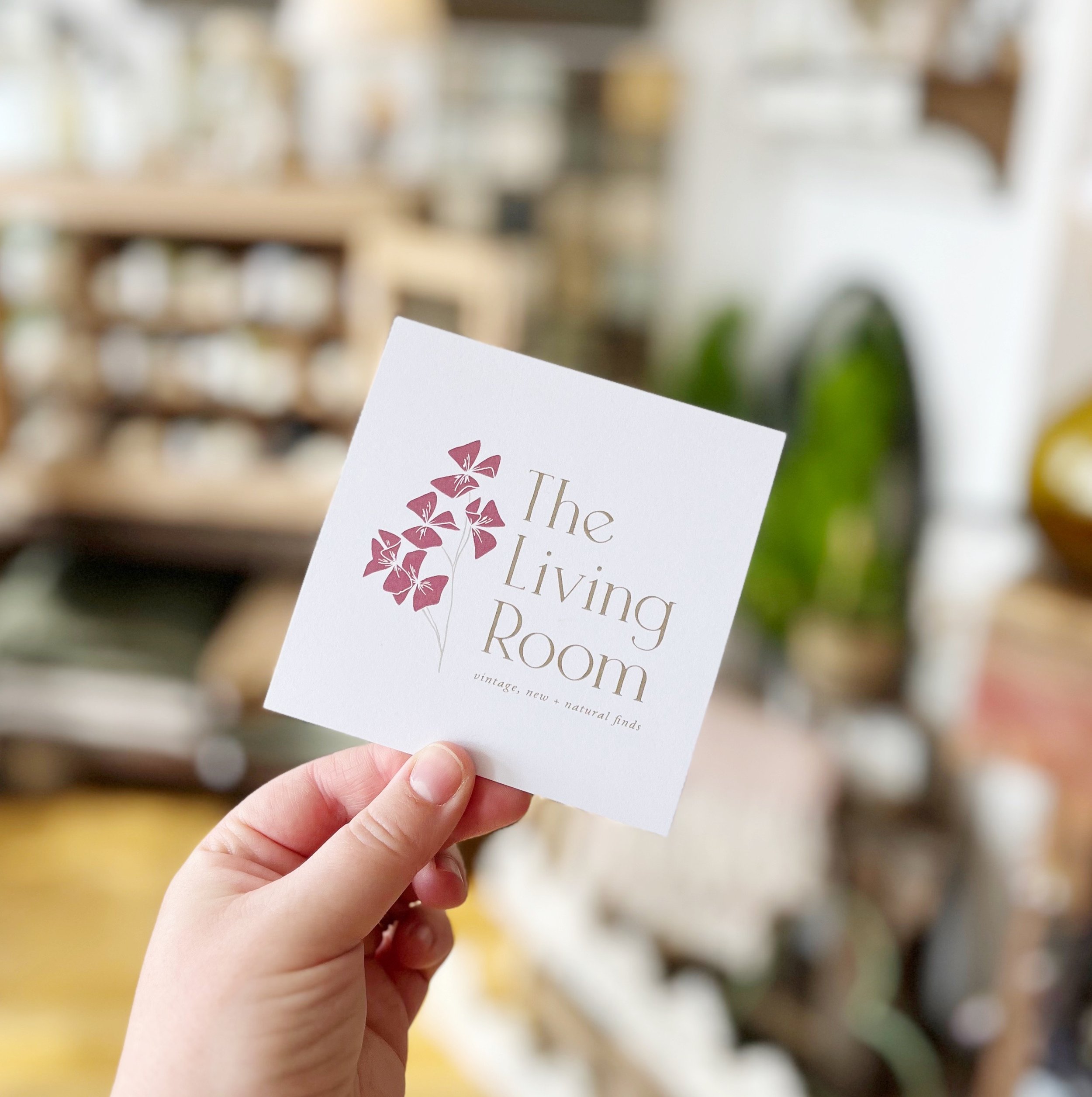
As well as the various logo designs and botanical illustrations, I also created some stationery for Hayley to use in the shop. There’s a range of sticker designs, 2 leaflets, and stamps to go on her paper bags.
“I’d like to say a very big THANK YOU to the wonderfully talented Emma who has been absolutely amazing to work with (& very patient!), and I’m very much looking forward to working with her again” Hayley - The Living Room
We’re moving on to work on a website soon, as well some other projects that I’ll keep secret for now. I’ve had so much fun working on this project and can’t wait for the next stage!
And of course, if you’re ever near to Shoreham-by-Sea, definitely go and visit Hayley’s beautiful shop!


Are you looking for a rebrand for your small business?